All work
Making Calendly Feel More Like Your Brand
Rethinking booking page customization through AI, user research, and a simpler approach to personalization.
Company
Calendly
Role
Senior Product Designer
focus
0-1 product design, AI, product strategy, user research
year
2026

Overview
For many businesses, a Calendly booking page is an extension of their brand. Yet despite strong demand for greater personalization, Calendly had no dedicated interface for customizing individual booking pages.
With branding already part of Calendly's paid offering, this created an opportunity to address a validated user need while strengthening the incentive to upgrade.
Leadership challenged me to imagine an AI-first approach to customization, giving me the freedom to explore the experience without the constraints of an existing solution.
I led the design exploration, taking the concept from manual appearance controls to an AI-assisted experience that could translate a user's existing website into a personalized booking page.
The challenge wasn't simply giving users more control. It was making their desired outcome easier to achieve.
The opportunity: A validated user need with business potential
Booking page customization wasn't a speculative feature idea.
In Calendly's 2026 MaxDiff research, look-and-feel customization ranked as the #1 most preferred feature, up from second place the previous year.
Existing product behavior also demonstrated demand for branding. Approximately 47% of weekly active users uploaded a logo, while 37% used existing branding controls.
Yet users still lacked a dedicated interface for customizing individual booking pages.
The opportunity was clear: give users more control over their booking experience while strengthening the value of Calendly's paid offering.
The challenge: How might we help users create booking pages that feel like their brand, without asking them to become designers?
#1
Most preferred feature
47%
Logo usage
37%
Branding control usage
Exploring what AI-first customization could become
I started with familiar customization patterns: colors, typography, imagery, and layouts. These offered flexibility, but they also required users to make a series of design decisions.
Early design explorations


That raised an important question: If users already have a brand, why should they have to recreate it inside Calendly?
I explored how AI could use an existing website to generate a recognizable branded starting point, allowing users to refine the result rather than build it from scratch.
With few constraints on the exploration, I pushed beyond individual appearance settings to consider different page layouts, reusable themes, and branded landing pages.
The goal was to make customization feel less like configuring a website and more like bringing an existing brand into Calendly.
The shift: From giving users more ways to customize, to giving them less work to do.
Final design

Turning an ambitious concept into something testable
As the experience evolved, I wanted to understand whether the AI-first approach actually made customization easier—or simply introduced a new kind of complexity.
Rather than relying on static mockups, I used Claude Code to rapidly build an interactive prototype that brought the proposed experience to life.
I then tested the prototype with 10 participants through Listen Labs, focusing on three questions:
Did users understand and value an AI-generated branded starting point?
Which customization capabilities mattered most?
Could users confidently predict how their changes would affect other booking pages?
This approach helped me move quickly from exploring possibilities to gathering evidence, without waiting for production development.

Turning insights into direction
The research reinforced the appeal of AI-assisted customization, but also surfaced areas where the experience needed to be clearer.
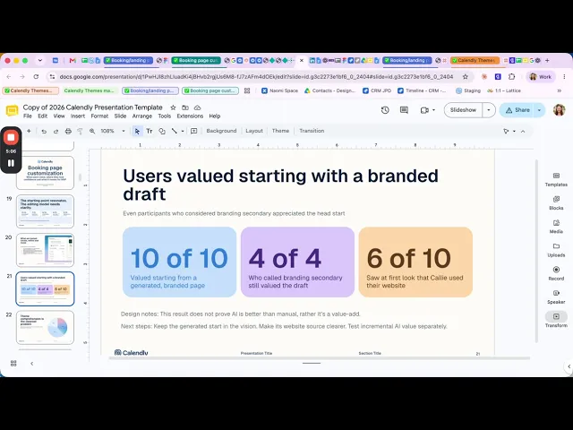
10/10 — Valued an AI-generated starting point
Participants appreciated starting with a recognizable brand experience rather than building one manually.
Design implication: Keep AI as the starting point, with manual controls for refinement.
7/10 — Prioritized recognizable brand elements
Logos and imagery helped participants connect the booking page to their existing business identity.
Design implication: Prioritize brand recognition over extensive customization options.
6/10 — Needed more clarity around shared themes
Participants didn't consistently understand when editing a theme would affect other booking pages.
Design implication: Make shared changes explicit before users apply them.
What changed because of the research
The most valuable outcome of testing wasn't simply confirming that users liked the concept.
It helped identify where our initial direction introduced unnecessary complexity.
The findings reinforced three priorities for the next iteration:
Lead with a recognizable result. Make it easy for users to see their brand reflected in the booking page before asking them to customize individual details.
Prioritize meaningful control. Focus on the elements that make a page feel personal, rather than exposing every possible appearance setting.
Make system behavior understandable. Clearly communicate when changes are local and when they affect other booking pages.
These priorities helped sharpen the direction toward an experience that balanced AI assistance, flexibility, and predictability.
What I've learned & what's next
This project began with an ambitious AI-first vision and few constraints. Through exploration, rapid prototyping, and user research, I helped turn that vision into a more focused product direction.
The research reinforced the appeal of AI-generated branding while revealing where users needed greater clarity and control, particularly when changes could affect multiple booking pages.
Although the experience hasn't shipped, the next step is to validate whether it delivers on both sides of the opportunity: making branding easier for users while creating meaningful value for Calendly's paid offering.
I'd measure success through customization adoption, time to publish a branded page, paid conversion, and booking completion.
My biggest takeaway: Giving users more control doesn't necessarily mean giving them more options. Sometimes, the most valuable design decision is removing the work they would otherwise have to do themselves.